
Data & Insights: Infographics and Charts by iVenturer Foundation
At iVenturer Foundation, we believe that data tells the story of innovation. Our curated collection of infographics, charts, and visual analytics highlights the most important trends in venture capital, startups, technology, and global markets.
From investment growth curves to startup success metrics, each visual is designed to transform complex data into clear, actionable insights. Whether you are an investor, entrepreneur, or policymaker, our visual reports help you see the bigger picture and make smarter decisions.
What You’ll Find Here
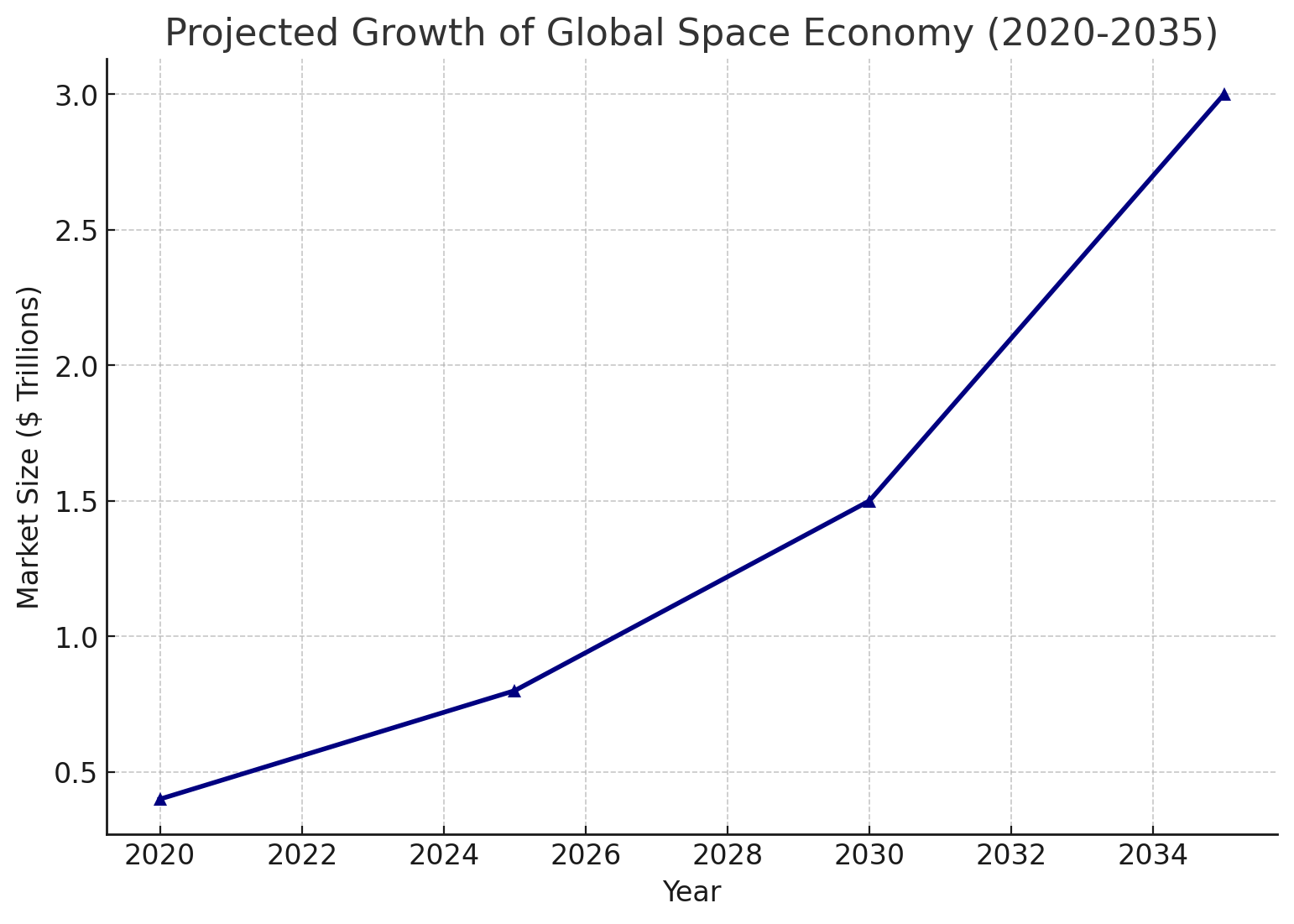
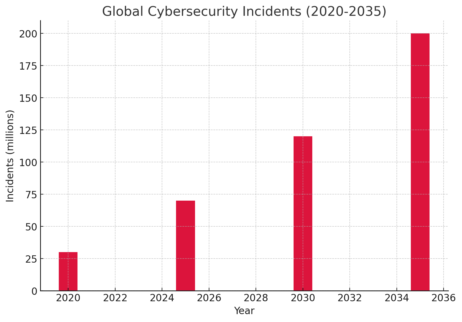
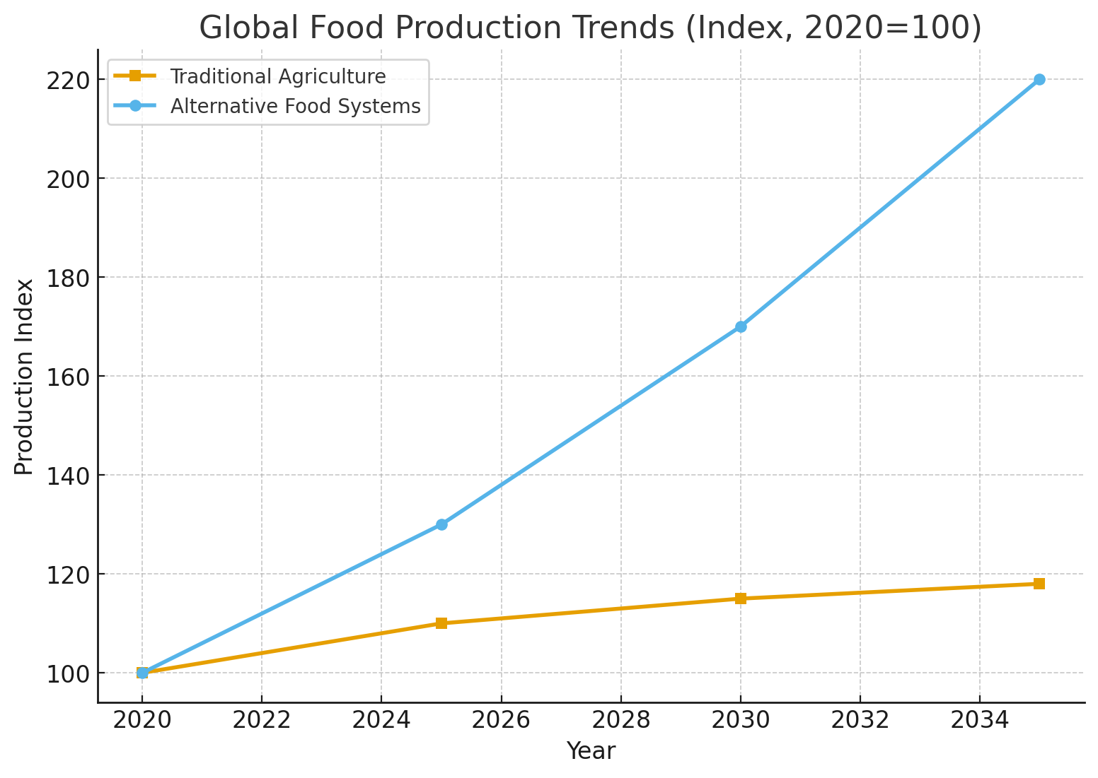
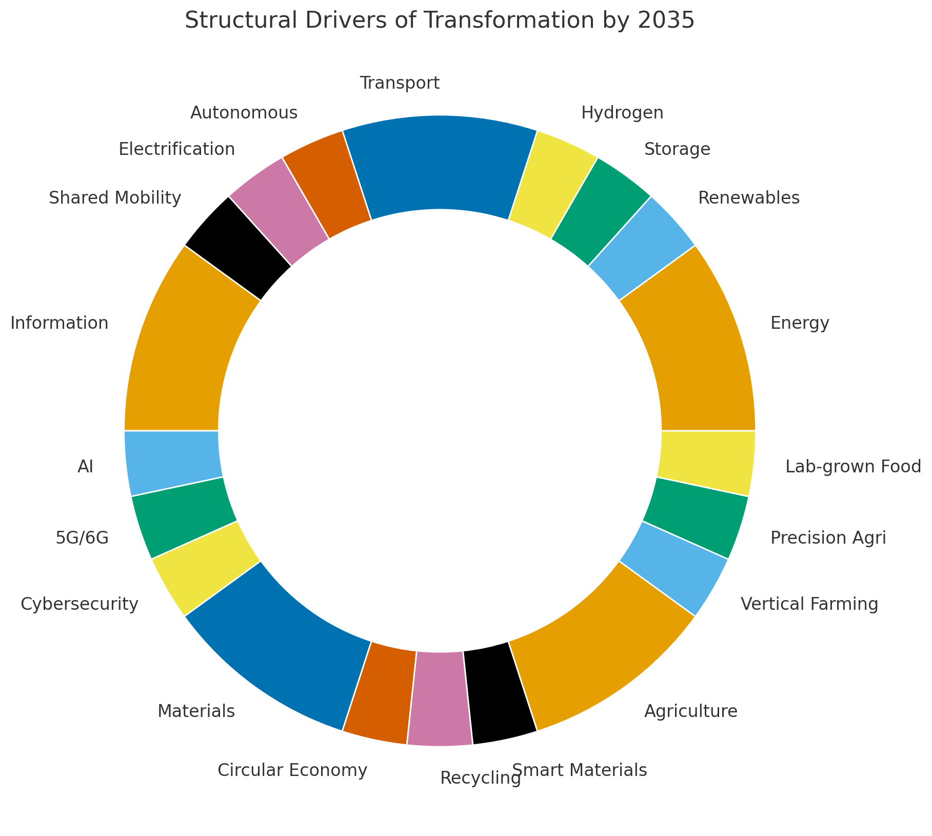
📊 Market Growth Charts — visual breakdowns of industries such as AI, blockchain, biotech, fintech, and creative industries.
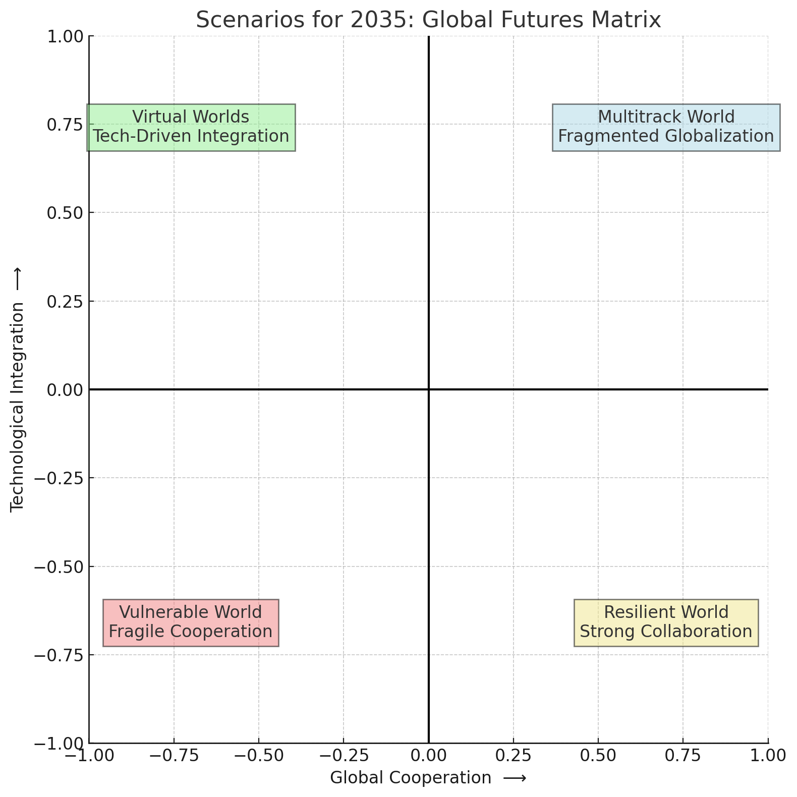
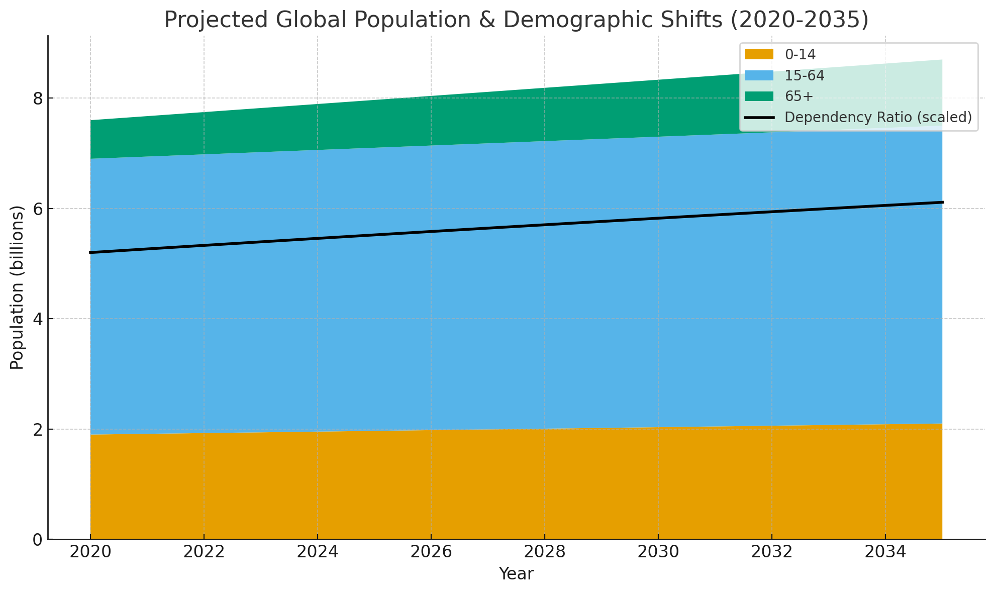
📈 Investment Trends Infographics — where global capital flows, regional hotspots, and emerging opportunities.
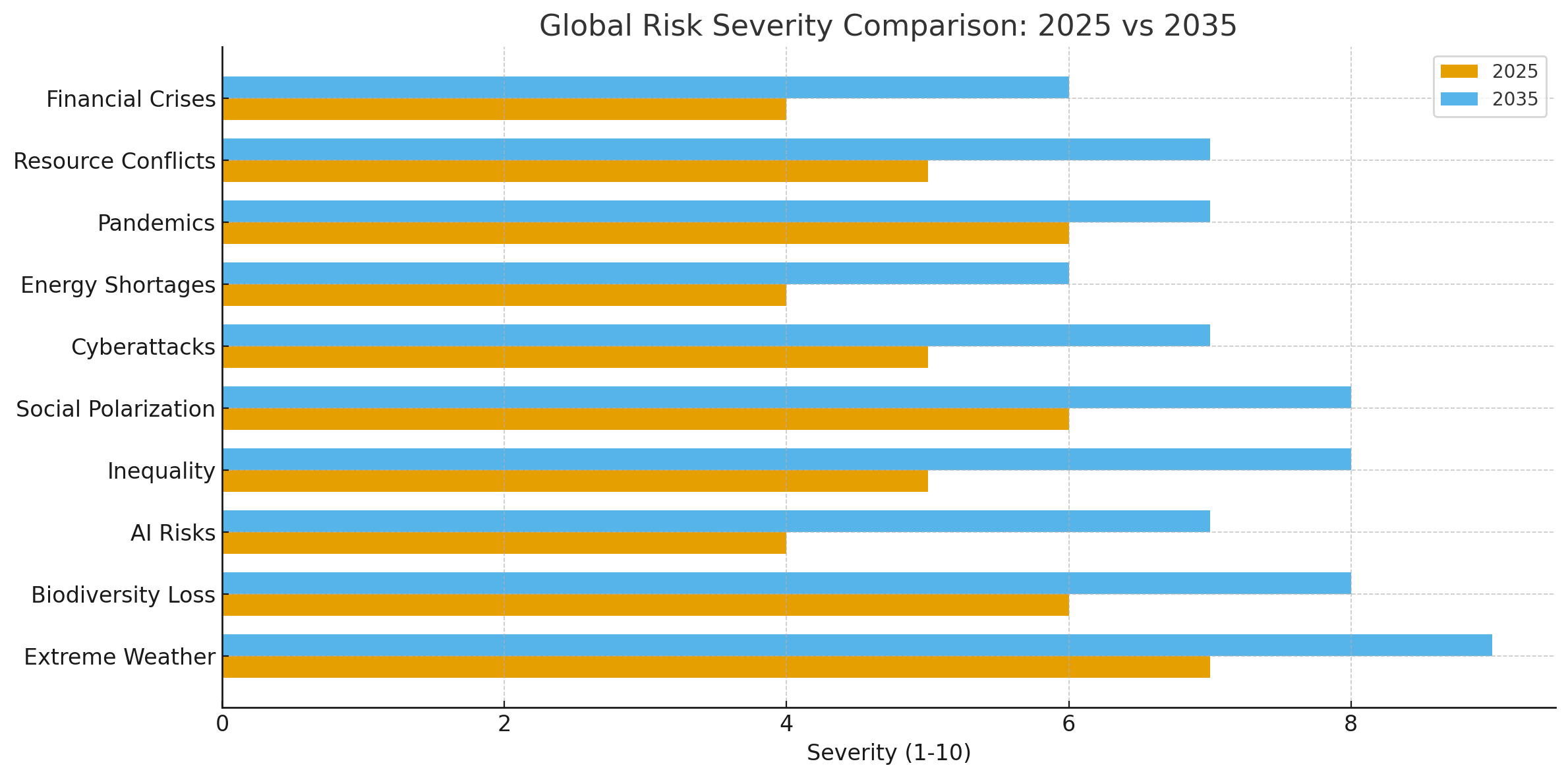
🔍 Startup Success Metrics — failure and success rates, exit strategies, funding stages, and ROI benchmarks.
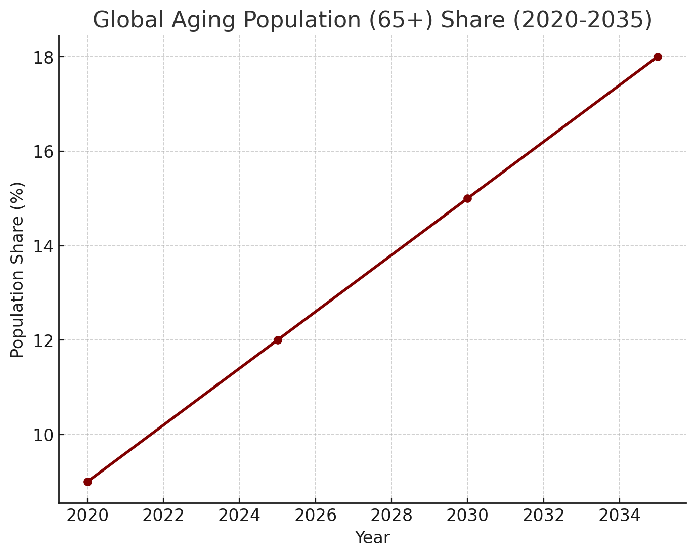
🌍 Global & Regional Comparisons — data on how Russia, Europe, Asia, and the U.S. ecosystems evolve and compete.
💡 Actionable Insights — all visuals are paired with commentary to help you understand what the numbers really mean.
Why It Matters
In a fast-changing world, visualized data helps cut through the noise. Instead of reading dozens of reports, you can explore digestible infographics that reveal trends at a glance.
Investors gain clarity on where to allocate capital.
Startups see what attracts funding and why.
Corporates and governments understand market shifts and policy impact.
About iVenturer Foundation
Since 2011, iVenturer Foundation has been a trusted platform connecting startups, investors, corporates, and cultural initiatives. With 300+ successful projects, $17M+ in commitments, and a global network of partners, we combine research, consulting, and media to empower innovation.
Our infographics and charts section is part of our mission to make the innovation economy transparent, accessible, and data-driven.